Binder

Your education resources,
all in one spot.
Save. Share. Collaborate.

View Prototype
Binder mockup image

My Role

UX Design, Visual Design, Branding & Identity

Tools

Pen/paper, Google Suite, Figma, Adobe Illustrator & Photoshop, Usability Hub

Deliverables

User Surveys, Competitive Analysis, Personas, User Stories and Flows, Wireframes, Branding & Identity, Prototypes, User Testing, Visual Design

Problem

Majority of educators use Google Drive to store and share files with their peers. Though it excels in many aspects, where it falls short for educators were search features, file organization and ability to save and share website links. Alternative methods and/or applications are being used to save and share links.

Solution

Focused on providing an efficient single platform solution, Binder allows educators to share and collaborate on all types of files and resources, including website links that can now be directly loaded. Keywords can be used to tag files, producing more accurate search results.

RESEARCH AND DISCOVERY

User Survey

With the user survey, I wanted to get an insight on how people utilize cloud-base storage services and how it’s meeting their needs. Three main focus were what they use it for, how often they utilize it, and pain points. Since I knew that I wanted to target educators, I created a section within the survey that asked additional questions to those who indicated that profession. Among educators, a common pain point was the lack of ability to load and share web links, like they would share files within folders.

View Survey Analysis
survey analysis graphs

Competitive Analysis

With the knowledge of popular applications and the biggest pain points in mind, I focused my analysis on Google Drive, Pinterest and ShareFile. I wanted to closely look at where each excels and falls short. Through conducting a SWOT analysis and closely examining each service, I was able to uncover where one excels, the others fall short, like saving links and collaboration features. With Google Drive excelling in file storage and sharing for broad range of users, and ShareFile excelling in business solutions, there is a potential for a new competitor that offers the complete collaboration tool that can fit the needs of businesses, but also everyday users.

View Competitive Analysis

User Personas

Based on survey results, follow-up interviews and analysis of the competition, created two user personas — A relatively new educator building up her resources, and a veteran educator who is also a leader with the school.

View User Personas
persona Jackie
  • Jackie

  • AGE 25
  • LOCATION Virginia
  • WORK Elementary Teacher
  • TIER Work and Personal Files
  • New educator gathering inspirations and resources
  • Goals
  • Save web links in project folders and be able to share them directly like other document files
  • Be able to organize files upon uploading, with folder suggestions
  • Frustrations
  • Reference links are shared a lot, and sometimes I have to make a Google Doc of links just to share more easily.
  • At times, I forget to organize files once I upload them and it’s difficult to relocate files
persona Allison
  • Allison

  • AGE 47
  • LOCATION Michigan
  • WORK High School Teacher
  • TIER Work Administration Files
  • Veteran resource creator and administrator
  • Goals
  • Organize files using keyword tags to specify a category and/or type of file
  • Be able to search and find files quickly and easily
  • Have the option to revert back to an archived version
  • Frustrations
  • Organization options are limited to just folders
  • It’s hard to search quickly for a file, even if they are organized in folders
  • Auto-save is great, but there are times when I need to go back to a previous version
INFORMATION ARCHITECTURE

User Stories

With these goals and frustrations in mind, created user stories for potential tasks of users.


Narrowed down priorities and determined MVP features:

  • File organization (folders, keywords, tagging)
  • Intuitive search feature also displaying folder location name
  • Ability to save links
  • Easy social collaboration environment
View User Stories
Role Task Importance
As a returning user I want to sign into my account High
As a returning user I want to upload a file High
As a returning user I want to replace a file High
As a returning user I want to share a file High
As a returning user I want to save a link to a website High
As a returning user I want to organize my files using folders and keywords High

User Flows & Sitemap

Began sketching out user flows to visualize how users would complete each task. Created many iterations to narrow down a smooth process. User flows were used to create a sitemap that shows how these user flows come together, and establish a hierarchy. With the user flows and sitemaps established, mapped out the content strategy for the application.

View User Flows & Sitemaps

Wireframes

Taking the user flows and site maps and translating them into a visual design began with sketching out how that could look like. The first iterations of the dashboard were very rough and one that changed the most throughout the sketching process. Once the dashboard was established, I moved on to the other screens. The main page was another one that went through multiple iterations.

View Lo-Fi Prototype

Low-Fidelity Usability Testing

The wireframes were then converted into a clickable prototype and usability testing was conducted to determine the functionality of the navigation and UI elements.

Tasks
  1. Signing up for an account
  2. Adding a piece of content
  3. Organizing a piece of content

Although all of the users successfully completed the tasks presented, there were two areas that required clarification:

  • Gray checkbox indicating file selection
  • Absence of a column sorting arrow
lo-fi testing issues
Takeaway

A big takeaway from this instance was that I cannot assume users would know how to navigate something that is a relatively familiar setup. When presented with a new platform, users tend to approach it with a new perspective.

View Detailed Analysis
BRANDING

Research & Sketching

Establishing a name and defining the brand began with looking back at survey results and the target audience. I wanted the brand to convey a message that it’s clean and organized. Through mind mapping, I listed out words related to education and task keywords.

Then I began brainstorming by combining words that convey that message.

logo mind mapping
logo sketches

Refining

With the name taking on a simple concept, I wanted the logo to take on that simplistic concept as well: A platform that is a well organized digital binder of a user’s work. Took the stronger concepts from my sketches and converted them digitally.

Round One - digital concepts
logo digital concepts
Round Two - refined versions
logo refined versions

Style Guide

Binder is a brand that represents organization, one that is easy to recognize, and conveys a friendly message.

View Style Guide
logo final versions
typography
color palette
VISUAL DESIGN

High Fidelity Prototype

With the brand established, I built out the high fidelity prototype, ensuring it stays aligned with the brand. To ensure positive design decisions were made, a series of preference tests were conducted on three elements.

Adjustments were made to the style guide during this process according to what worked visually and practically during the design process with the preference and usability testing.

CTA Button Shape
CTA button shape option 1 CTA button shape option 2
Text Treatment
Text Treatment option 1 Text Treatment option 2
File Detail Modal Window Layout
Shareable Link option 1 Shareable Link option 2

Usability Testing & Iterations

With the UI elements tested and revised, the next step was to conduct user testing and test out those changes. The first round of usability testing consisted of four tasks:

Tasks
  1. reset password
  2. add a new file
  3. navigate to a file, share & delete a file
  4. reply to a comment on a document

The adjustments made after the first lo-fi usability test were a success in the initial round of hi-fi usability testing, and users could clearly distinguish the functionality.

lo-fi testing issues
lo-fi testing solutions recap

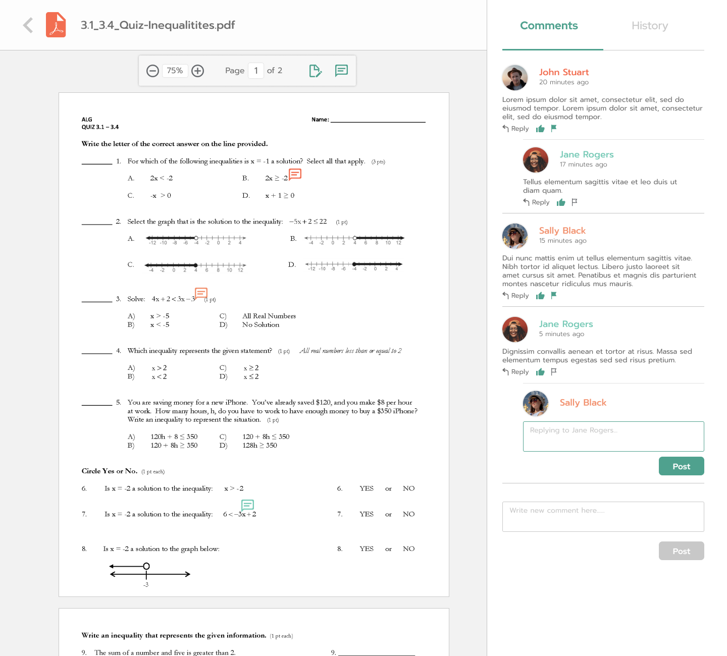
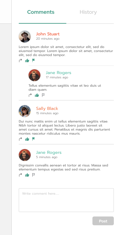
Users were able to successfully complete all of the tasks except for one, which was adding a direct reply to a comment. The results were surprising and the degree of confusion was unexpected.


The two main pain points here were:

  • Not knowing where to click in order to directly reply to a comment
  • Not knowing that you are typing a reply to a specific comment
hi-fi commenting testing results

Iterations were made based on these results and feedback. Verbal prompt on the button was changed to “post” and a more distinguishable comment box was added to appear directly under the comment.

Additional Iterations and Testing

In order to figure out the root of the issue and ensure the next round of iterations are successful, I conducted additional navigation and preference tests.

Navigation Testing

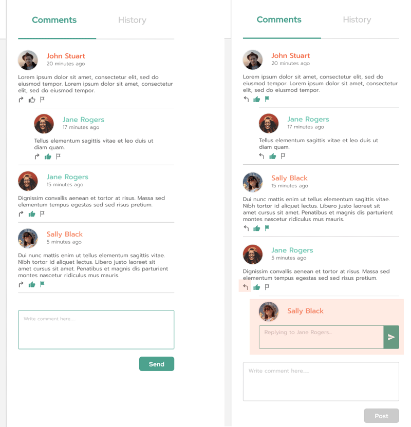
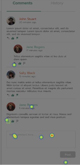
Users were shown the refined layouts of the commenting section and instructed to reply to a most recent comment.

Only 1 out of 10 users clicked in the correct spot. Most users clicked on the general comment box.
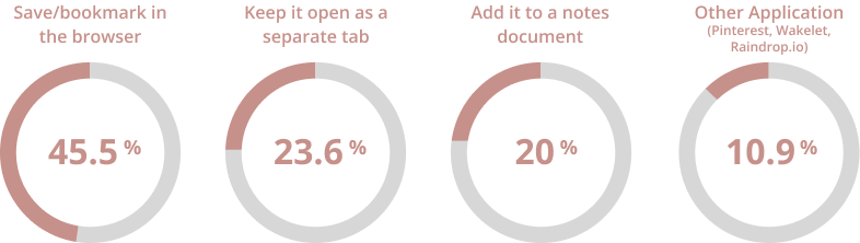
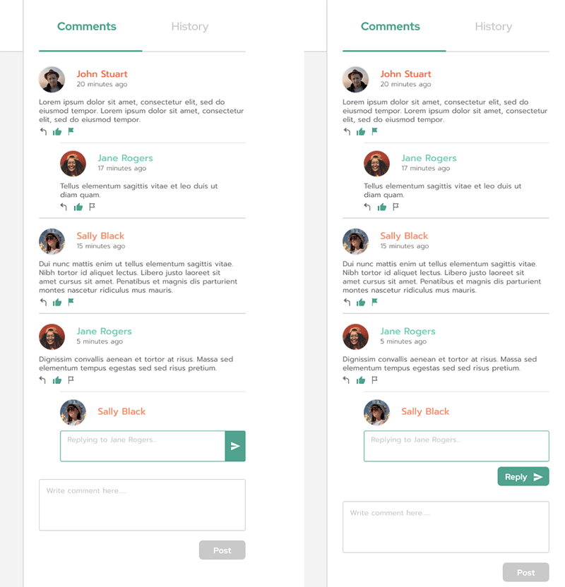
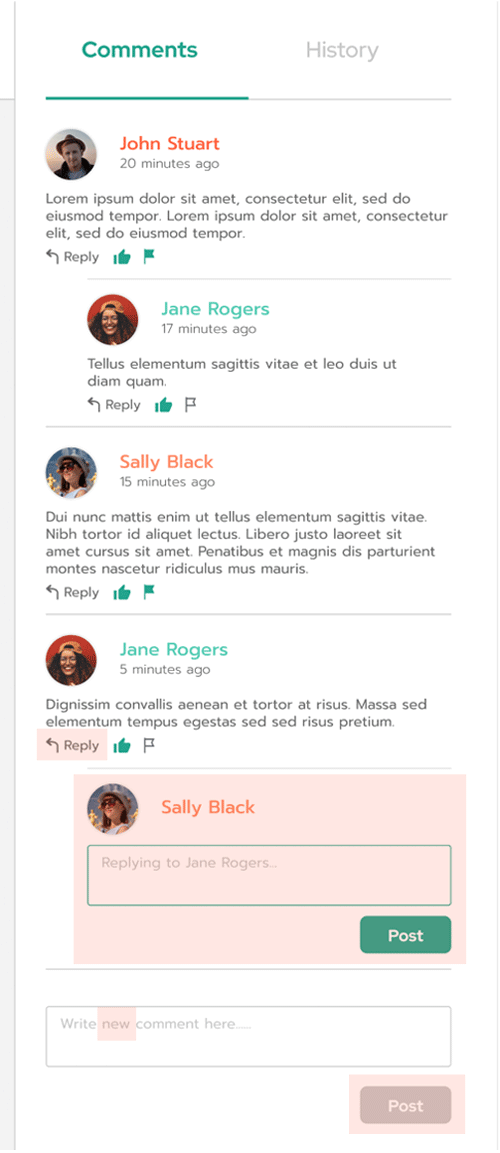
hi-fi commenting hotspot results
A/B Testing
  • A follow-up question asked if the alternative design with the word “reply” added makes the task more clear. 70% of the users indicated that it does, and one user did not notice a difference in design.
  • I also conducted a preference test on the comment box, testing icon and text prompt.
hi-fi commenting hotspot results
Final Outcome

I was able to use this feedback to fine tune my product:

  • The word “reply” was added to the icon
  • CTA text for the comment boxes were changed to “post”
  • For the general new comment box, the word “new” was added to the pre-filled text to help communicate that it’s for new comments
commenting feature initial layout
commenting feature final result
final layouts

Conclusion + Takeaways

Binder was created to set itself apart from the competitors and become a tool specifically for educators that provides easy file management, and also allow them to share web links all within a single application. Through various user testing and feedback, Binder has become a tool that meets the needs of the user. Going into this project, I was worried about trying to enter a market with such strong competitors, and knowing that user preferences can vary drastically. But having a specific target audience helped alleviate the stress and focus on the specifics. The process had many successes and failures, but also surprising results. The file collaboration commenting features turned out to be more complicated than anticipated, and the icons and verbal prompts were not interpreted as expected. This refinement required the most testing and design iterations.

I learned that User survey and usability testing questions need to be better worded and very specific. Instead of going straight into a task question, I need to setup the scene first, so that the type of user response is what I intended. I learned that you cannot assume that a user would be familiar with certain features/tasks just because those features exist on other applications users already use. This project taught me the importance of user feedback and how invaluable it is. If I had more time and resources, I would definitely do more user deeper testing for each iteration, testing out more variations. I would take time to think more carefully through each step and design decision. Lastly, I would build out the mobile application and conduct testing, to ensure that Binder truly is a cloud service that meets the demands of the user all-around.