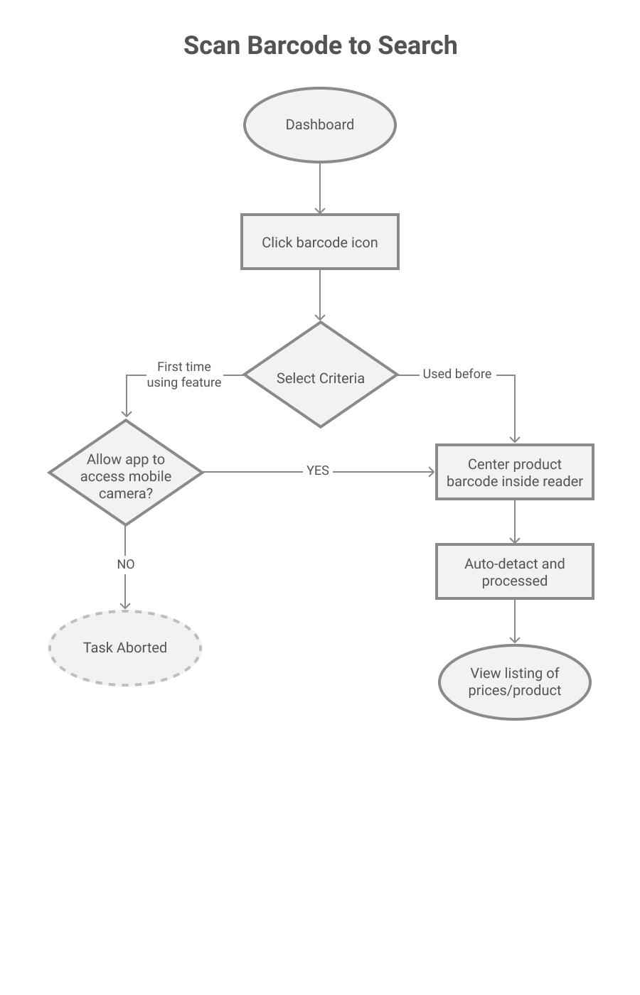
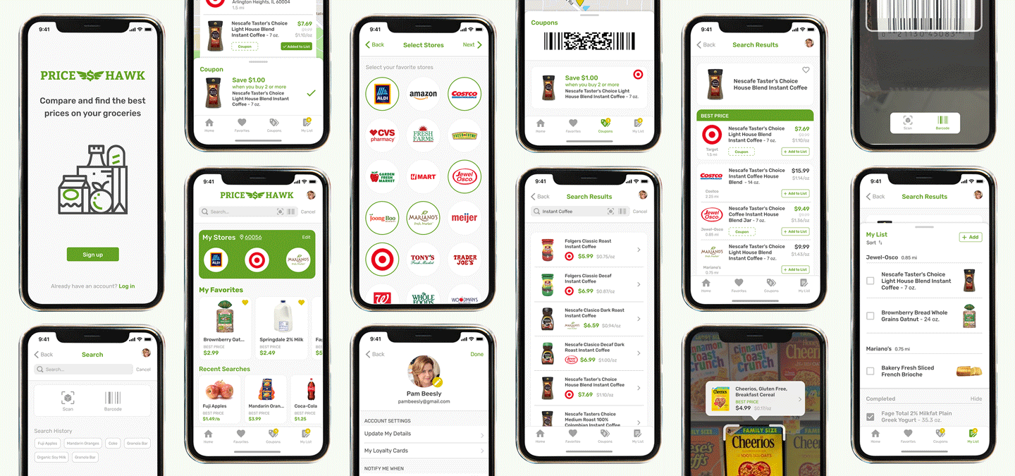
PriceHawk

Compare prices on everything you need.
Minimize your trips.

View Prototype

My Role

UX Design, Visual Design, Branding & Identity

Tools

Pen/paper, Google Suite, Figma, Adobe Illustrator & Photoshop, Maze, Usability Hub

Deliverables

User Surveys, Competitive Analysis, Personas, User Stories and Flows, Wireframes, Branding & Identity, Prototypes, User Testing, Visual Design

Problem

Shoppers are having to use multiple sites and/or apps to search and compare prices from various stores for a product they need. Too much time is going into finding the information they need, and with unit prices not being shown consistently, shoppers are having to do the breakdown themselves. As a result, shoppers are not conducting price comparisons, and in the end, not always finding the best deals.

Solution

Introducing PriceHawk, a grocery shopping companion app that helps you search and compare all products at once. No more having to search per store or having to calculate the unit price. Shoppers are able to open the app and conduct a quick search for what they need.

RESEARCH AND DISCOVERY

User Survey

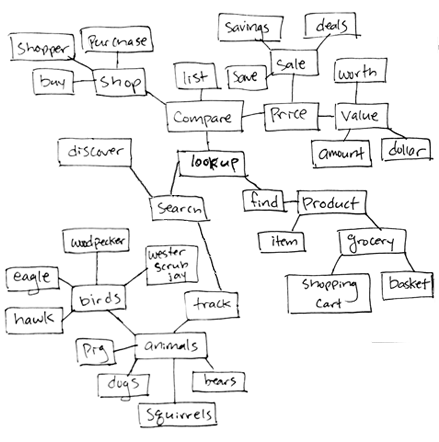
Through this research, I wanted to get an insight on shopper patterns and gauge how many people actually compare prices. An interesting discovery was that not as many people actually use the various applications that are currently available. The results of this survey provided a good direction in terms of how to further study the various types of shoppers and discover how to change app usage patterns. Three main focuses were how often they compare prices, what resource(s) they currently use, and pain points. A common pain point was the time consuming effort of looking up products to compare prices. Another was not always being able to see the unit price. Of the participants, only 60% compared prices, and from that group, 32% look at sales and deals on physical weekly ads, 32% look up on individual store’s websites, and 16% use an app that displays weekly ads. Only 1 shopper uses an app that compares various stores, and the rest use various other methods.

View Survey Analysis

Competitive Analysis

With the knowledge of popular applications and the biggest pain points in mind, I focused my analysis on Instacart, Basket and Flipp. I wanted to closely look at where each excels and falls short. Where one excels, the others fall short, like comparing prices on all types of items and all stores at once.

View Competitive Analysis

User Personas

Based on survey results, follow-up interviews and analysis of the competition, created two user personas — An extreme couponer who wants to find the best savings and get the most out of her set budget, and a busy casual shopper who values her time over acquiring the best deals.

View User Personas
persona Jessica
  • Jessica

  • AGE 38
  • LOCATION Indiana
  • WORK Math Teacher
  • TIER Extreme Couponer
  • Working parent looking to get the most out of set budget
  • Goals
  • Product searches that are better with suggestions
  • Be able to compare all products, on sale and regular price
  • Have unit prices be more prominent so that I’m not searching for it
  • Frustrations
  • Many times, I need to search by product and see the price comparison
  • I want to see all of the products, even ones that are not on sale
  • Unit price breakdowns aren’t always clear or noticeable
persona Megan
  • Megan

  • AGE 45
  • LOCATION Virginia
  • WORK Dentist
  • TIER Busy casual shopper
  • Busy Working Parent juggling shopping and kids’ activities
  • Goals
  • Make finding best prices easier and quicker
  • Locate unit prices easier to make comparing less time consuming
  • See alternative product suggestions so that I con’t have to search
  • Frustrations
  • I don’t have enough time, nor want to, sit there and compare prices.
  • Sometimes find the unit price on products is difficult to locate
  • Healthier options are always pricier, but finding a reasonable alternative is hard
INFORMATION ARCHITECTURE

User Stories

With these goals and frustrations in mind, created user stories for potential tasks of users.


Narrowed down priorities and determined MVP features:

  • Search for all types of products
  • Compare Prices from multiple stores
  • Make a shopping list
  • See and clip available coupons
View User Stories
Role Task Importance
As a new user I want to set up an account High
As a new user I want to set my current location High
As a new user I want to select my favorite stores High
As a returning user I want to sign in to my account High
As a returning user I want to search for all products High
As a returning user I want to compare products at multiple stores High
As a returning user I want to see available coupons High
As a returning user I want to see what's on sale and what's not High
As a returning user I want to see unit prices High
As a returning user I want to make a shopping list High
As a returning user I want to see product suggestions in search bar High

User Flows & Sitemap

Sketched out user flows to visualize the path a user would take for each task. As the user flows were digitized, modifications were later made as the wireframes were built.

View User Flows & Sitemaps

Wireframes

I first began sketching out the main screen and laying out the key elements that should be visible when a user signs in. Next step was to plan out the subsequent screens as the user navigates. Different navbar layouts were explored during this process.

View Lo-Fi Prototype
wireframe sketch 1
wireframe sketch 2

Low-Fidelity Usability Testing

Once the sketches were refined and the initial layouts set, wireframes were finalized in Figma. The wireframes helped to visualize and test the flow of the potential application. Each screen so far included the necessary information users need to see. Placement of icons, functions, features were explored in different ways to discover the best option.

Takeaway
  1. Shopping List link moved to be within navbar
  2. Unit price visible also in store comparison list, not just in store/item detail view
BRANDING

Research & Sketching

In order to establish a name that would define and convey the goal of the brand, I began creating a mind map listing out words that are related to shopping and price comparison.

Then I created word combinations that stood out, and narrowed down to one that conveys the goal of the brand and began sketching ideas.

logo mind mapping 1
logo mind mapping 2
logo sketches

Refining

After sketching various ideas and conducting preference tests on concepts and iterations to better gauge which option best conveys the brand message, I was able to finalize my logo iterations to reflect a simple and clean brand.

Digital Concepts
logo digital concepts
Moodboard
logo refined versions

Style Guide

I envisioned the brand to be a friendly shopper companion, that helps the user find the information easily without being looked at as a hassle.

The color palette consists of a primary and secondary colors, an accent color, and neutrals. The primary color is a bright forest green to convey a fresh, trustworthy brand.

The typefaces were chosen due to their geometric shapes that provide versatility for larger body of text and smaller font sizes, and mainly providing great legibility for the numbers at any scale.

View Style Guide
VISUAL DESIGN

High Fidelity Prototype

With the brand established, each user flow wireframe was visually brought to life to test the user experience and ensure the MVP requirements are met.

Adjustments were made to the layout to ensure they follow the human interface guidelines.

Usability Testing & Iterations

With the initial layouts revised and set, several different types of user testing were conducted. The first round of hi-fi usability testing consisted of having the users carry out four tasks:

Tasks
  1. Sign up and set up a new account
  2. Conduct a search and compare prices from several stores
  3. Add item to shopping list and view & clip a coupon
  4. Scan to conduct a search

Users were able to successfully complete most of the tasks smoothly without too many delays or issues. Key details, like the unit prices, stood out and helped the users quickly obtain the information they needed. Navigation issues in terms of quick access to sections arose, and placements of icons and fields were noted to reconsider. Something surprising that arose during the testing was that Androids users were not yet familiar/accustomed to in-app barcode scanning.

preference test - add to list
preference test - AR scan

Couple pain points were:

  • Not knowing to click on the barcode icon, and knowing that everything is done within the app
  • Not being able to intuitively navigate back to the main page from subsequent pages
  • Not knowing “My Popular Items” are also my favorite items

Iterations were made based on these feedback. To test out usability for navigating through the flows and user preference on features, a Maze usability test was setup with the same four tasks as missions.

The test results revealed that there were many misclicks occuring when users were tasked to perform a search. Due to the high number of misclicks and where they were clicking, it was hard to draw a definite conclusion of results.


But I was able to draw couple possible scenarios:

  • The search icon was not being noticed as expected
  • Even though they were given the scenario and what to search for, the testers’ natural instinct was to search by store and/or click a product on the main page to search
maze heatmap result 1
maze heatmap result 2

Additional Iterations and Testing

The heatmaps were crucial in providing a visual pattern to user preference and logic. With these results, another round of iterations were made and additional preference tests were conducted.


Based on these findings, additional rounds of iterations took place to further enhance the app and finalized.

final layouts

Conclusion + Takeaways

PriceHawk was born out of a desire to help a busy shopper by making the process of searching and comparing prices easier to complete and manage. Through various research, extensive user testing and feedback, PriceHawk has become a shopper companion that can help enhance the overall experience.

Going into this project, I was worried about entering a market with such large and popular competitors. But through analysis and research, I was able to find a niche to set it apart from the rest. Trying to create a flow that speeds up the search process, yet also is detailed and intuitive was challenging. But having the key MVPs and main goals in mind helped to keep myself aligned on what I need to focus on in order to make this successful.

Couple things that surprised me were learning that scanning a barcode was still not a familiar concept to some android users, and that AR(augmented reality) is still a very new and foreign concept to many. If I had more time and resources, I would do more detailed testing of each flow to test out different approaches. I would also create more design concepts for the main screen, and test to ensure the final product satisfies the needs of the average shopper.